Non-Profit Website Redesign:
Animal House Rescue
- Problem
-
The Animal House Rescue Website, a Birmingham animal rescue charity, is not very responsive and could look more engaging to the user. There is also a lack of hierarchy which makes the content confusing for users.
- Solution
-
To build a responsive website that has a clear content hierarchy and a clean UI design that engages the user.
- My Role
-
This was a group Project with three members. We collaborated throughout and I took responsibility for the stakeholder interview, user scenario, navigation design and iteration after user testing.
Research
Proto-Persona
A proto-persona, Caroline, was creaated to understand the typical user's needs and base the future research on.

Heuristic Analysis
Next, a heuristic evaluation was done to analyse what the current website was like to use. There were three main takeaways.
- Inconsistent Content
-
For example, the phone number is very prominent on the navigation bar however there is a warning message saying to contact them via email.
- Lack of Hierarchy
-
There is a lot of information on the website but it is not clear what is the most important, especially on the pet listing pages.
There are no call to action buttons on the pet listing pages and seven on the donate page which makes it confusing for users to know where to go next.
- Poor UI
-
The body text and images are very small and the images are also cramped together and small.

Usability Testing
We took into account the issues we found in the heuristic analysis and Caroline’s goals from the proto-persona to check our pain point assumptions were correct and identify any usability issues on the current Animal House Rescue Website.
Users had three tasks to complete:
- Task 1
- Discover what the charity’s mission is.
- Task 2
- Find an animal you would like to adopt within your budget of £400.
- Task 3
- Please find and fill out the adoption form of the animal.
Affinity Diagram
Once the usability testing was completed we sorted the results into similar groups in an affinity diagram to identify the main insights.
Users found it hard to identify the charity’s missions because there are no headings explaining the content and the text is very small and hard to read.
Participants were overwhelmed with the amount of content on the pet listings page and weren’t sure what the most important information was. Some users found it hard to find the adoption price as the information was squished together.
There were contrasting views about the adoption form, some participants found it straightforward to fill in whereas others struggled to find the form and thought that the pet they had chosen would already be in place rather than having to type in the name.

Empathy Map
From the results of the affinity diagram an empathy map was created to understand what Caroline thinks when using the Animal House Rescue website.

Stakeholder Interview
I interviewed the CEO and founder of the charity, Lyn, to discover what her main goals for the website are.
Wants the homepage to be appealing and invite users to go further.
Website needs to inform people what animals need rehoming and the other ways they can help and donate to the charity.
Needs the website to be simple, easy to use and ‘idiot proof’ so users can navigate it easily.
The goal of the website tone is to be cheerful, bright, friendly and sunny and not focus on the dark side of animal rescue.
User Insight Statements
Two user insight statements were created, one adoption based and done donation based from the previous research to enable us to focus on the main goals of the users.
- Adoption User Insight
- An animal lover adopting from a rescue shelter wants to ensure a seamless and clear adoption process whilst also knowing their adoption fee is going towards a great charity with a rewarding cause.
- Donation User Insight
- An animal lover that doesn’t have any space to adopt an animal wants to know the other ways they can help the charity including donating money and their time.
Problem Statement
From the user insight statements a problem statement was developed to concisely show the problem that needs to be solved and guide the ideation process.
The Animal House Rescue focuses on pet adoption and donations to support the charity. We have observed that the Animal House Rescue website isn’t giving clear instructions for the pet adoption process and users are unable to find information on other ways to help the charity such as donating money and volunteering.
How might we improve the charity’s website so that more adoptions are successful, more donations are received and more volunteering hours are filled?
Ideate
Brainstorming and Feature Prioritisation
The I Like, I Wish, What if method of brainstorming was used for idea generation. These ideas were then put into a feature prioritisation matrix considering what is a high priority for the user and charity. Three new features were chosen to develop.
Donate button on the global navigation bar
A filter system for pets
Include more pet images
The overall UI hierarchy and the content UI were also going to be improved

UX Scenarios
Two user scenarios for the two pathways, donate and adopt, were created to understand how users would use the new website.


Card Sorting
Although the Animal House Rescue website has only a few pages card sorting was carried out to ensure the user pathways were as simple as possible and content was grouped logically.

User Flow Diagrams
A user flow was done for the adoption and donation pathways to understand what decisions users would take when on the website and how they move through the content.

Prototype
Mid-Fidelity Prototype and Testing
Mid-fidelity prototypes were built from the pages identified on the sitemap and user flow diagrams. The new website features created in the ideate phase were also added to the wireframes. The prototypes were tested to understand if any usability issues occurred during three tasks.
- Task 1
- Discover what the charity’s mission is.
- Task 2
- Go to the adopt a cat page and filter the results by under five years old and female, choose a cat named bubbles and apply to adopt her.
- Task 3
- Please find the place where you could make a £10 monthly donation to the charity.

- Main Takeways
-
Participants took a while to realise that the monthly donation was highlighted on the donate page and initially thought that it was just a single donation form.
The filter pop-out was confusing as participants were not immediately sure where to click to close the box.
- Improvements to Make
-
Add a button to the filters pop-out that says ‘search’ or ‘apply filters’.
Make it clear on the donation form that users can toggle between single and monthly donations.
UI Design Guide
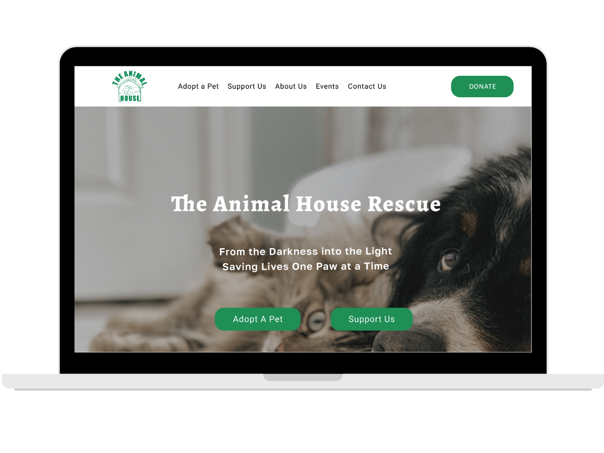
We looked for UI inspiration from other animal rescue charity websites such as Blue Cross and Battersea Cats and Dogs to see how pet listing and donation form pages could be structured. A design guide was then built based on the tone requirements from Lyn, the CEO, as cheerful, friendly playful and sunny. UI elements including navigation and pet cards were designed.

High-Fidelity Prototypes
High-fidelity prototypes were made by applying the design guide to the mid-fidelity prototypes. Improvements to the UI were made using the feedback from the mid-fidelity testing.

Test
User Testing
The high-fidelity testing used the same testing tasks as the mid-fidelity testing to ensure consistency in results.
- Task 1
- Discover what the charity’s mission is.
- Task 2
- Go to the adopt a cat page and filter the results by under five years old and female, choose a cat named bubbles and apply to adopt her.
- Task 3
- Please find the place where you could make a £10 monthly donation to the charity.
| Task | Success Rate |
|---|---|
| 1 | 100% |
| 2 | 100% |
| 3 | 100% |
The success rate was 100% on all of the tasks however there was some feedback on the UI so further iterations were made.
High-Fidelity Iteration
The hierarchy of the pet listing page was improved by increasing the size of name text. The donation form was also changed to make it clear where to click next after users took longer than expected to find the correct button. I also improved the filters panel by adding ticks to filled boxes to make it clearer which categories were selected.
Before

After

Final Prototype
Below is a brief demonstration of the finalised design. Please go to the figma link if you would like to see more!
Conclusion
Next Steps
- Show the designs to the stakeholder and iterate on their feedback.
- Time constraints meant we were unable to design and test mobile prototypes, which would be the priority.
- Several iterations were made to the Donation Form over the project and I would like to do further A/B testing to understand what structure and colours are best for the user to understand its function the quickest.
Reflection
I interviewed the stakeholder after we had done the majority of the research phase. It was during this interview I realised I had forgotten about the other needs of the charity and other patrons who might not have enough space for a pet or who have already adopted but still want to support the charity in other ways, such as donation. There was not enough time to complete thorough user research on the donation function of the website so a lot of assumptions had to be made. In future projects I will always try consider more than just the primary user and remember that there are multiple reasons people use products and that they might not be obvious on first look.